Military Drone
Training App
This UI was aimed to create an immersive drone control experience where users can focus primarily on the live aerial feed without feeling overwhelmed by controls.
UI design
Themoe.
2026

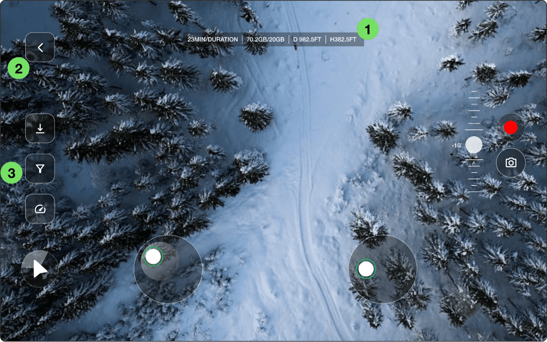
Design Decisions - In-flight mode
1
Telemetry strip — centre top, always visible
Positioned top-centre so it sits at the edge of peripheral vision while the operator watches the live feed below.
2
Back button — top-left, isolated
The back chevron sits alone in the top-left corner in a distinct rounded-square pill. Follows Android navigation convention exactly — operators exit the screen through muscle memory without active thought.
3
Action toolbar on the left edge
This keeps the central camera feed fully unobstructed — the operator's primary visual task is watching the feed, not the controls.

4
Symmetrical joystick positioning
Virtual joysticks are placed symmetrically at the bottom corners to replicate the feel of physical drone controllers. This improves ergonomics and reduces the learning curve for users familiar with gaming or UAV controls.
5
Vertical camera adjustment control
The vertical slider on the right side was designed to mimic professional camera and gimbal systems. Its placement allows quick camera-angle adjustments while maintaining uninterrupted movement control.
Semi-transparent control containers
Controls use translucent dark backgrounds to maintain readability while minimizing obstruction over the live footage. This creates a lightweight interface that feels modern without competing with the visual feed.
Design Decisions - Drone Overview

1
Centralized drone visualization
The 3D drone model is positioned at the center to establish a strong visual focus and create an immediate connection between the user and the selected UAV.
2
Dark interface for visual hierarchy
A dark UI theme was selected to emphasize the drone model and reduce visual noise. The darker background also improves contrast for system indicators and contributes to a more premium, futuristic aesthetic.
3
Strong primary action placement
The “Go Play” button is isolated on the bottom-right corner to clearly establish it as the primary action. High contrast and spacing help the CTA stand out immediately without competing with secondary information.
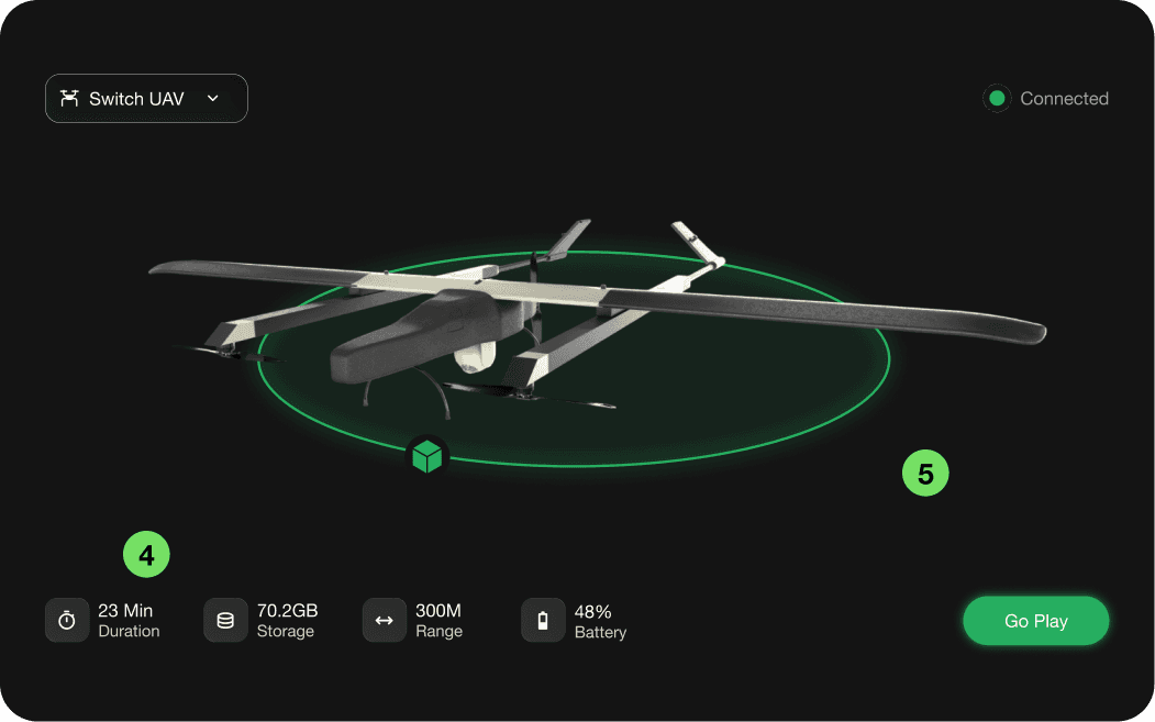
4
Bottom-aligned status information
Drone statistics such as flight duration, storage, range, and battery are grouped along the bottom for quick scanning. Separating informational content from interaction areas improves readability and spatial organization.
5
Spacious layout to reduce cognitive load
Large amounts of negative space were intentionally preserved to avoid a cluttered technical dashboard appearance. This creates a cleaner experience and directs user attention toward the drone visualization and key actions.
Military Drone
Training App
This UI was aimed to create an immersive drone control experience where users can focus primarily on the live aerial feed without feeling overwhelmed by controls.
UI design
Themoe.
2026

Design Decisions - In-flight mode
1
Telemetry strip — centre top, always visible
Positioned top-centre so it sits at the edge of peripheral vision while the operator watches the live feed below.
2
Back button — top-left, isolated
The back chevron sits alone in the top-left corner in a distinct rounded-square pill. Follows Android navigation convention exactly — operators exit the screen through muscle memory without active thought.
3
Action toolbar on the left edge
This keeps the central camera feed fully unobstructed — the operator's primary visual task is watching the feed, not the controls.
4
Symmetrical joystick positioning
Virtual joysticks are placed symmetrically at the bottom corners to replicate the feel of physical drone controllers. This improves ergonomics and reduces the learning curve for users familiar with gaming or UAV controls.
5
Vertical camera adjustment control
The vertical slider on the right side was designed to mimic professional camera and gimbal systems. Its placement allows quick camera-angle adjustments while maintaining uninterrupted movement control.
Semi-transparent control containers
Controls use translucent dark backgrounds to maintain readability while minimizing obstruction over the live footage. This creates a lightweight interface that feels modern without competing with the visual feed.
Design Decisions - Drone Overview
1
Centralized drone visualization
The 3D drone model is positioned at the center to establish a strong visual focus and create an immediate connection between the user and the selected UAV.
2
Dark interface for visual hierarchy
A dark UI theme was selected to emphasize the drone model and reduce visual noise. The darker background also improves contrast for system indicators and contributes to a more premium, futuristic aesthetic.
3
Strong primary action placement
The “Go Play” button is isolated on the bottom-right corner to clearly establish it as the primary action. High contrast and spacing help the CTA stand out immediately without competing with secondary information.
4
Bottom-aligned status information
Drone statistics such as flight duration, storage, range, and battery are grouped along the bottom for quick scanning. Separating informational content from interaction areas improves readability and spatial organization.
5
Spacious layout to reduce cognitive load
Large amounts of negative space were intentionally preserved to avoid a cluttered technical dashboard appearance. This creates a cleaner experience and directs user attention toward the drone visualization and key actions.
Analytics 4
Go to next project